When the Migration Became Something Bigger: The BBVA Public Web Relaunch
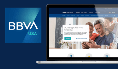
BBVA USA needed to replace its aging CMS with Adobe Experience Manager and apply a new global brand to its public-facing website — with the USA site as the worldwide pilot. What started as a migration became a full-scale organizational design and knowledge-transfer challenge.
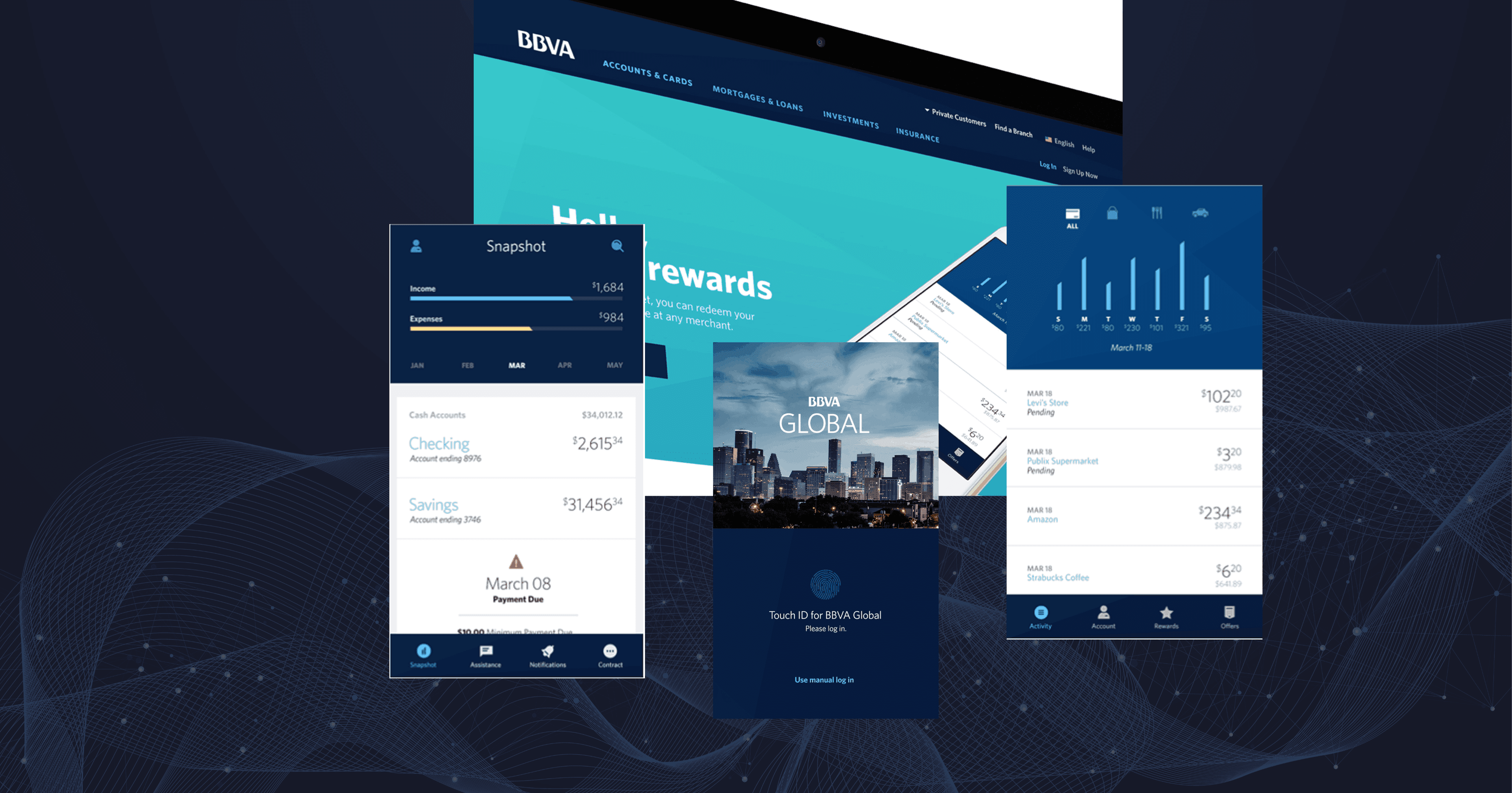
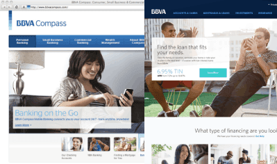
The starting point wasn't a blank canvas — it was something harder. There was an existing website with over 200 pages to audit, a legacy CMS being retired, and a single concept page from Madrid that represented the new visual direction. One page. Built from that, the entire BBVA USA public web needed to exist.
The creative and development teams were split across locations. The global brand team was based in Spain. The local design and content teams were in the US. The Adobe development team was on-site but operating on their own sprint cycle. There was no shared component library, no established design-to-development handoff process, and no documentation system in place for the new brand.
The project was scoped as a CMS migration. It turned out to be something considerably larger than that.
Here's the irony embedded in this kind of project: the tighter the timeline, the less time anyone has to build the infrastructure that makes the timeline achievable.
We had less than a year to design, build, and launch a fully rebranded public website for a financial institution — with a development team operating on sprint cycles we couldn't always sync with, stakeholders across multiple time zones, and a team that was actively growing throughout the project. Every week, new people joined who needed to understand decisions that had already been made, components that were already built, and standards that were still being documented.
The constraint wasn't resources or budget. It was the compounding cost of growth without a system to absorb it. Every person added to the team was also a person who needed onboarding, context, and clarity — and that work fell on the people who were simultaneously trying to ship.
Most design leads in this situation would have put their head down and focused on output — designing faster, reviewing more, keeping pace with development. I did some of that. But early on, I recognized that the bottleneck wasn't velocity. It was legibility. People couldn't move fast because they didn't know what decisions had been made, what the standards were, or who to ask.
The first thing I did was define the core team structure — who approves, who executes, who reviews. Not as a bureaucratic move, but as a practical one. When a team is growing and decisions are coming from multiple directions, you need a clear path for how things get decided and who owns what. I established a small oversight group and created defined points of contact between the design team and the development team.
Then I looked at the handoff problem. Design and development were on different rhythms. Developers were starting sprint work before design decisions were fully resolved, which meant they were building against assumptions that would later change. I introduced weekly design sprints — not to slow development down, but to create a consistent checkpoint where both sides could review function and style before development locked it in. The goal was to shrink the revision cycles, not eliminate speed.
The language barrier with the Madrid team was its own challenge. Early in the project, decisions made in remote calls would get lost — not because either side was being unclear, but because the Madrid team was communicating in their second language, and English words don't always carry the same intent as the original. What they said was correct. What they meant was sometimes something else entirely, and we wouldn't discover the gap until work was already in motion. I learned to be more deliberate about written follow-up after every significant call, to ask clarifying questions about intent rather than just content, and to treat alignment as something to verify rather than assume. That adjustment made me a better communicator across the board — and it's a habit I've kept.
The thing I kept coming back to: if I got hit by a bus tomorrow, could this project continue? For the first few months, the answer was probably no. That bothered me. So I started building the thing that would outlast my direct involvement.
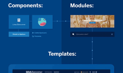
The Design System and Component Architecture
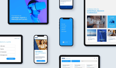
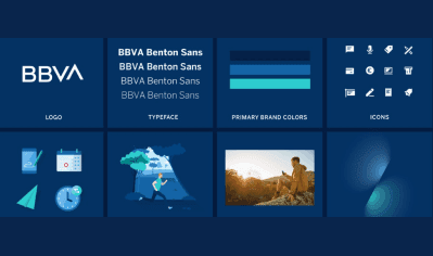
Working from a single concept page and the emerging global brand direction, I led the design of BBVA USA's component library from scratch — custom AEM components, templates, icon systems, illustrations, and a holistic visual language that had to feel coherent across 200+ pages and multiple device contexts. Every component had to be editable within AEM, which meant design decisions had to be made with authoring flexibility in mind from the start, not retrofitted later.
Responsive design wasn't optional — the old site hadn't been mobile-optimized, and mobile experience was explicitly on the roadmap. That meant designing for multiple breakpoints simultaneously during a period when we were also racing to keep pace with development sprints.
The Playbook
The more consequential thing I built wasn't a component. It was a documentation system.
I had been developing an internal playbook prior to the relaunch — a reference for design standards, code, SEO requirements, and content authoring guidance. When the team started growing rapidly, I recognized this wasn't a nice-to-have anymore. It was the only way to scale knowledge without bottlenecking everything through me.
I partnered with a colleague to take the playbook from a static internal document to a dynamic, externally-served system — built in PHP and Sass, managed through GitHub, and accessible to the team without needing to ask anyone for a file. Design standards, component options, styling rules, code snippets, authoring guidance — all of it in one place, versioned and maintained. The playbook became the source of truth for both the local team and vendors working on third-party BBVA-branded properties.
The pattern it created — teach one person, who teaches another, who teaches the next — extended well beyond the launch date. What started as a documentation tool became a knowledge-transfer system.
User Experience and Journey Design
I led whiteboard sessions defining user flows, page journeys, and accessibility requirements. User testing was conducted with iQuanti, using eye tracking and analytics to validate design decisions before they were locked into development. WCAG 2.0 accessibility standards were applied throughout — at the time a meaningful commitment for a financial institution's public web presence.
I introduced the tools and processes that became standard for BBVA creative operations — the software stack, the file management conventions, the design review structure. These weren't only local decisions. They became the foundation that other BBVA country teams built on when they implemented the global brand in their own markets.
The team grew from roughly 10 to over 30 people in six months. That growth would have been chaotic without the structural work we'd done early. Because we had the playbook, defined component standards, and clear team roles, new team members could onboard to the system without everything routing through me.
I won't pretend it was seamless. Fast growth never is. There were moments where design decisions and development assumptions diverged and required course correction. There were communication gaps with the Madrid team that took weeks to fully resolve. But the systems held — and the team held together.
When the site launched on March 14, 2017, the call center didn't spike. That's not a trivial thing. A major site redesign almost always creates a surge in support calls — users who can't find what they expected, flows that changed without warning. The fact that ours didn't is evidence that the UX decisions we made, and the care we put into the transition from the old experience to the new one, actually worked.
Outcome
Three months after launch (data through June 2017):
44% increase in total organic traffic
90% increase in mobile traffic year-over-year — the first time the site had a fully responsive mobile experience
32% increase in checking traffic year-over-year
24% increase in total checking conversions year-over-year
102% increase in checking app completions year-over-year
No meaningful increase in call center volume — atypical for a full site relaunch of this scale
The Playbook continued to serve as the internal reference for BBVA USA design standards well after launch — revised and updated as the brand evolved. BBVA USA was later acquired and BBVA's operations outside the United States are where the brand lives today, but the design foundations built during this project are still visible in that work. What we built wasn't just for the launch. It was built to be carried forward.
The design foundation built for the USA pilot became the starting point for BBVA's global brand rollout across other country markets.
Working on something that needs this kind of thinking?
I help teams build systems that scale — and the governance to keep them working.